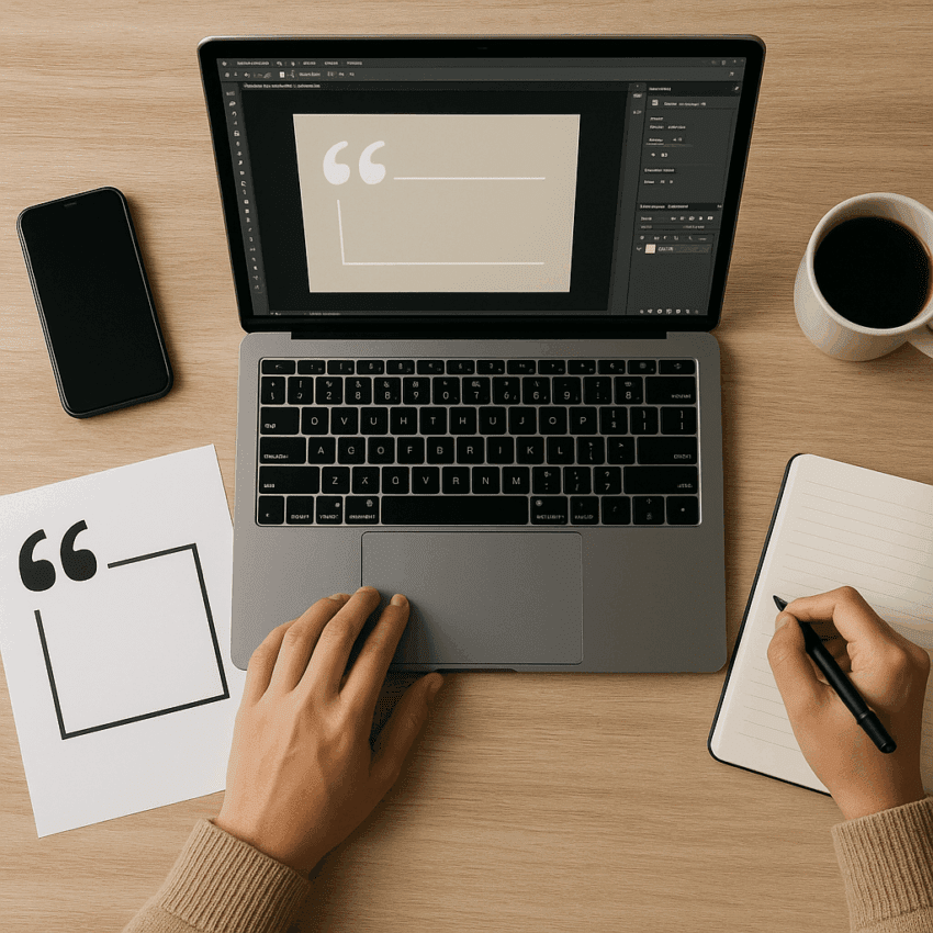
Quote graphics distill meaning into a single frame: an arresting sentence, composed with visual intention, that stops a scrolling thumb and sparks connection. They are tiny containers of storytelling, brand personality, and community values. When they work, they feel inevitable—clear words, clean shapes, generous breathing room—and the message lingers. This guide unpacks the strategy, craft, and workflow behind impactful quote graphics for social media, from sourcing and ethics to typography, color, motion, testing, and measurement.
Why Quote Graphics Work on Social Media
People scan feeds quickly, filtering an onslaught of stimuli. A good quote graphic respects that reality by offering a crisp idea, minimal cognitive friction, and a visual structure that guides the eye. It’s the opposite of clutter: strong contrast, uncluttered composition, and decisive emphasis. The result is higher engagement and better recall, especially when the design shepherds attention with intention.
The psychology in brief
- Chunking: A short line of text framed with clear whitespace is easier to parse and remember than a long paragraph.
- Salience: High-level ideas (values, motivation, identity) are inherently shareable; quote graphics make those ideas visible and portable.
- Visual hierarchy: Size, weight, and placement act as a nonverbal guide, telling viewers what to read first and why it matters.
- Consistency: Repetition of brand motifs creates familiarity, which improves recognition and reduces processing time.
What platforms favor
Across major platforms, static images remain a staple in mixed-format strategies. While algorithms evolve, several patterns persist:
- Feed real estate matters. Taller images (4:5 portrait) occupy more vertical space in Instagram feeds than square visuals, improving the odds of a pause.
- Carousels let you lead with a strong quote and add context on subsequent slides, turning a quick stop into a mini-journey.
- LinkedIn displays images prominently in the feed and preview, and brands often report improved conversation rates with image-led posts.
- Pinterest treats quote graphics as evergreen assets, if designed with search-friendly text overlays and keywords in the description.
Accessibility remains essential at global scale: the World Health Organization estimates that over 2.2 billion people live with a vision impairment or blindness. That reality, combined with mobile-first consumption, makes legible type, adequate line spacing, and clear color contrast nonnegotiable.
Choosing the Right Quote: Sourcing, Fit, and Ethics
A striking design can’t rescue a vague or misaligned message. Start with intent and work backward.
Define purpose before selecting words
- Inspire: Values, resilience, craft pride. Pick lines that uplift without drifting into cliché.
- Educate: Condense a core principle or framework into a polished, standalone sentence.
- Entertain: Wit and wordplay, as long as tone matches your brand voice.
- Mobilize: Calls to action that are specific, time-bound, and benefit-focused.
Source with rigor
- Verify attribution. Cross-check at least two reliable sources for author, date, and exact wording.
- Prefer original language. Translations often drift; if you use one, note “adapted” or “translated.”
- Draw from your ecosystem. Customer testimonials, founder notes, or excerpts from your own thought leadership build authenticity and trust.
- Avoid overused lines. If a phrase has saturated the internet, it’s hard to make it feel fresh—unless your design or context reframes it.
Legal and ethical guardrails
- Copyright: Short phrases are sometimes not protected in certain jurisdictions, but entire passages generally are. When in doubt, obtain permission or quote only brief excerpts with commentary.
- Public domain: Many classic texts are safe; still confirm the author’s death date and local rules.
- Fair use: Complex and context-specific; education, critique, and transformation may qualify, but do not assume. When the quote is core to your graphic, seek rights.
- Attribution: Always include the author. Consider also listing the source (book, talk, interview) in the caption or a subtle footer.
Design Fundamentals That Drive Results
Design transforms a sentence into a scannable, memorable message. Three pillars—hierarchy, readability, and structure—do most of the heavy lifting.
Typography
- Typeface selection: Pair one expressive display font (for the quote) with a neutral sans-serif or serif (for the attribution). Avoid pairing two divas; you want one star and one supporting role.
- Scale and emphasis: Let the most meaningful nouns or verbs carry weight. Consider using weight, case, or color instead of italics for mobile clarity.
- Line length: Aim for 35–65 characters per line for comfortable reading. On narrow screens, adjust tracking and manual line breaks to prevent awkward rags and hyphenation.
- Line spacing: Increase leading until lines breathe without drifting apart; too tight reduces clarity, too loose kills rhythm.
- Attribution styling: Smaller size, lighter weight, and quieter color maintain focus on the message while honoring the author.
Color and contrast
- Contrast for legibility: Follow WCAG 2.1 AA guidance—at least 4.5:1 contrast ratio for normal text and 3:1 for large text. This is especially crucial for thin scripts or light weights.
- Overlays for imagery: If using a photographic background, add a soft dark or light overlay to protect type from busy textures.
- Brand palettes: Start with your core palette, then define a functional palette for backgrounds, highlights, and emphasis that preserves consistency across a series.
Composition and spacing
- Grids: Use a simple 8- or 10-point grid. Keep comfortable margins to avoid edge tension, especially in platforms that crop thumbnails.
- Focal point: One idea per frame. Resist the urge to add icons, watermarks, and shapes unless they clarify meaning or brand.
- Balance: Test left, center, and right alignment; choose based on the quote’s rhythm and any background elements.
Imagery choices
- Solid or textured backgrounds for maximum clarity.
- Minimalist photography (shallow depth of field, clean negative space) when tone benefits from mood and context.
- Illustration to create distinctive brand voice when photography feels generic.
Accessibility essentials
- Alt text: Write a concise description that captures the quote and attribution. Don’t repeat the entire caption if redundant.
- Minimum sizes: Keep type comfortably legible on a 5–6 inch phone. Test at 100% on a physical device.
- Color vision: Avoid relying on color alone for emphasis; pair with weight, size, or underline. File for accessibility is as brand-protective as it is user-centric.
Platform Optimization and File Prep
One design rarely fits every channel. Adapt layouts to match feed norms and screen behavior while protecting the core idea.
Aspect ratios that travel well
- Instagram Feed: 4:5 portrait for maximum on-screen height; 1:1 for cross-posting ease.
- Stories, Reels, Shorts, TikTok: 9:16 vertical; keep key text inside safe zones to avoid UI overlays.
- LinkedIn and Facebook: 1:1 for square cards; 4:5 or 16:9 depending on context and preview behavior.
- Pinterest: Tall vertical pins (e.g., 2:3) designed for search and saves.
Formats and export settings
- PNG for crisp text and flat color; JPG for photo-heavy backgrounds at appropriate quality.
- WebP where supported for smaller sizes without noticeable loss.
- Keep file sizes lean for fast loading; compress without introducing artifacts around type.
Captions, tags, and context
- Caption depth: Pair a concise hook with optional context (story, source, or micro-lesson). The graphic gets attention; the caption earns conversation.
- Hashtags: Use a mix of branded and topical. Avoid overstuffing; focus on relevance.
- Alt text and accessibility settings: Add them at upload; don’t leave this step to chance.
Motion, Carousels, and Advanced Variations
Static quote graphics are effective, but motion can add nuance and energy when used with restraint.
Subtle animation
- Text reveal: Fade or slide in segments to pace reading without distraction.
- Background shimmer or grain: Adds texture while keeping the words the star.
- Loop discipline: Short, seamless loops reduce file size and feel intentional.
Carousels as micro-stories
- Slide 1: The quote, uncluttered.
- Slide 2–3: A short interpretation or example.
- Slide 4: A question that invites comments or reflection.
- Slide 5: Soft call to explore more (article, newsletter, or resource) if platform-appropriate.
Interactive overlays
- Stories stickers: Polls or questions that ask viewers to share perspectives on the quote.
- UGC prompts: Invite followers to remix the design template with their own lines.
Brand Systems: Consistency Without Sameness
Series win attention through reliable structure and thoughtful variation. Document a micro-design system so multiple teammates can produce on-brand assets quickly.
Define a reusable kit
- Layouts: A small set of templates for short, medium, and long quotes.
- Type ramp: Named styles (Quote-L, Quote-M, Attribution) with sizes and leading.
- Color tokens: Background, text-primary, text-secondary, accent.
- Logo lockups: Corner marks at restrained sizes, with clear margins.
Guardrails for experimentation
- What can flex: Background texture, accent color, illustration style.
- What stays fixed: Typefaces, spacing system, attribution style, and placement.
Workflow, Tools, and Templates
A smooth workflow turns creative intention into consistent output. Build around speed, quality, and reuse.
Tools
- Design: Figma, Adobe Illustrator, or Affinity Designer for vectors; Canva or Adobe Express for team-friendly templates.
- Automation: Variables and components (Figma), bulk replace (Canva), or scripts/actions (Photoshop) to swap text and export batches.
- Proofing: Shared boards or comments for fast approvals; maintain a single source of truth for templates.
Template anatomy
- Text frames with smart resizing and manual line breaks for mobile.
- Style sheets for quote and attribution, locked to brand tokens.
- Safe zone guides to protect key text from platform UI overlays.
- Export presets for common aspect ratios and formats.
Production checklist
- Paste quote, verify attribution, and spell-check.
- Adjust line breaks by meaning, not just width.
- Test at small sizes on a phone; fix any cramped letters or muddy contrasts.
- Add alt text and a caption with context or a conversation prompt.
- Export, compress, and schedule with a clear content calendar.
Distribution Strategy and Community Fit
Distribution turns design into outcomes. Reach grows when the graphic aligns with audience needs and channel patterns.
Timing and cadence
- Rhythm over bursts: Aim for dependable touchpoints instead of sporadic floods.
- Contextual timing: Tie quotes to product milestones, cultural moments, or editorial themes.
- Cross-posting with intent: Adapt captions and aspect ratios to each platform’s norms.
Caption frameworks that spark conversation
- Question-led: Ask what the quote changes about a common assumption.
- Story-led: Share a 2–3 sentence vignette showing the quote in action.
- Advice-led: Offer one practical step to apply the idea today.
Community participation
- Spotlight audience quotes with permission. Nothing beats community-cast wisdom.
- Remix prompts: Publish blank templates or “fill-in-the-blank” cards.
- Credit actively: Tag authors and collaborators to extend reach and goodwill.
Measurement, Experimentation, and Learning Loops
Make design a hypothesis, not a guess. Define success, test variations, and learn fast with analytics.
Set metrics that matter
- Primary: Saves and shares indicate real resonance; comments show depth; reach tracks distribution.
- Secondary: Profile visits, follower growth, click-through to linked resources.
- Quality signals: Sentiment in comments, DM replies, and mentions.
A/B testing ideas
- Type emphasis: Bold the verb vs. the key noun.
- Alignment: Centered vs. left-aligned for the same quote.
- Background: Solid color vs. soft texture; dark mode vs. light mode.
- Caption style: Question vs. story prompt.
What the data often shows
- Legibility wins: Clear, high-contrast type consistently outperforms stylized but hard-to-read treatments.
- Specificity beats vagueness: Quotes with concrete nouns and verbs get more shareability than generic platitudes.
- Series outperform one-offs: Visual families accumulate recognition, improving scroll-stopping power over time.
Common Pitfalls and How to Avoid Them
- Overdesigned cards: Too many fonts, shapes, or filters dilute the message. Subtract until only the essential remains.
- Weak attribution: Missing or tiny author lines erode credibility; balance prominence without stealing focus.
- Poor readability: Low contrast, thin scripts, or tight tracking harm performance—especially on small screens.
- Inconsistent tone: If your brand promises clarity and care, sarcastic or edgy quotes may feel off.
- Over-branding: A large logo in a corner can feel like an ad. Trust consistent design cues to signal source.
- Ignoring alt text and captions: You miss SEO, accessibility, and context benefits.
Real-World Patterns That Work
- The “Big Word” treatment: Enlarge one critical word (e.g., COURAGE) as a background watermark behind the quote to anchor attention.
- Two-tone emphasis: Use your primary brand color for verbs and a neutral for the rest; subtle but directive.
- Framed whitespace: A generous margin acts as a silent frame, increasing perceived quality and legibility.
- Signature texture: A quiet grain or paper texture across the series becomes a recognizable fingerprint.
- Attribution stamp: A consistent micro-lockup for author and source adds trust and polish.
Inclusivity, Localization, and Cultural Nuance
Quotes carry cultural weight. Design and content choices should welcome a broad audience.
- Language adaptations: Translate with cultural sensitivity, not literalism. Reflow type for different line lengths and scripts.
- Right-to-left support: Mirror layouts as needed; rethink iconography direction and emphasis.
- Tone scanning: Some idioms don’t travel; test with native speakers or regional teammates.
- Device diversity: Design and test for low-end phones and limited bandwidth; keep files small and legibility high.
From Single Card to Campaign
Quote graphics can be a gateway format, leading to deeper assets and outcomes.
- Topic clusters: Build weekly sets around a theme, culminating in a blog post, podcast, or webinar.
- Lifecycle moments: Use quotes to preview launches, underscore values in hiring campaigns, or reinforce learning in customer onboarding.
- Repurposing: Turn longer interviews or talks into a month of quotes, each linking back to the full resource.
A Note on Data and Accessibility Standards
Design choices are often measurable. While specific engagement rates vary by audience and platform, consistent findings across brand accounts show that clear type, decisive hierarchy, and strong color contrast correlate with better outcomes. Accessibility isn’t only ethical—it’s effective. The WHO estimates that more than 2.2 billion people live with a vision impairment or blindness, and WCAG 2.1 AA contrast thresholds (4.5:1 for normal text; 3:1 for large) are a pragmatic baseline to reach more people—without sacrificing style.
Mini Checklist: From Idea to Post
- Clarify goal and audience.
- Choose a quote that aligns with brand voice and values.
- Verify attribution; decide how and where to credit.
- Design for readability: type, spacing, and mobile testing.
- Ensure consistency with your series system (colors, spacing, attribution style).
- Check accessibility: contrast, alt text, concise copy.
- Export correct ratios and formats; compress responsibly.
- Write a caption that adds context and invites response.
- Publish with a clear distribution plan; tag relevant authors.
- Review performance and iterate using analytics.
Closing Thoughts
Impactful quote graphics are not accidents of inspiration; they are the product of disciplined craft and empathetic choices. When you combine purposeful words with visual clarity, when you respect attention and design for understanding, you create assets that travel—cards your audience saves, shares, and remembers. Build a lean system, test relentlessly, and refine with data. Over time, your series will do more than fill a content calendar: it will articulate your point of view, nurture community, and compound brand engagement.