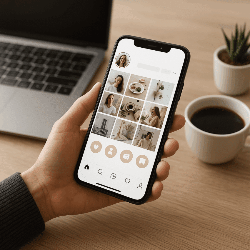
Instagram Highlights sit at the top of your profile like a curated storefront for your brand’s best stories. Used well, they turn fleeting 24-hour content into an always-on library that drives discovery, trust, and action. This guide shows how to plan, design, and measure Highlights so they work as a strategic system—one that orients new visitors, shortens time-to-decision, answers objections, and nudges the right next step.
Why Instagram Highlights Are a Strategic Asset
Highlights live directly under your bio, the highest-value real estate of your profile. They serve as your instant orientation hub, giving first-time visitors context and giving returning followers a faster path to what matters. Think of Highlights as micro-landing pages: each one packages a storyline or resource with clarity and intent.
- Reach and behavior context: Instagram reports over 2 billion monthly active users. Stories are used by 500M+ accounts daily, and roughly a third of the most-viewed Stories come from businesses (Meta/Instagram internal data shared over recent years). That makes Highlights—persisted Stories—an ideal bridge between ephemeral engagement and durable profile utility.
- Commercial intent: Instagram has publicly stated that a large portion of users follow businesses, and previous Facebook IQ research found Stories can influence interest and consideration. Highlights keep those persuasion moments available long after the initial 24 hours.
- Attention economics: Your profile gets seconds, not minutes. Highlights reduce friction by clustering answers (“What do you sell?” “How do I buy?” “Can I trust you?”) into tap-friendly bundles that accelerate conversion.
When designed intentionally, Highlights support every stage of the funnel: awareness (About, Press), consideration (Tutorials, Reviews), decision (Pricing, Shipping & Returns), and loyalty (Community, Events, Tips). They also compound your brand’s credibility over time: a mature, up-to-date set signals operational excellence and care for the user experience.
Plan Your Highlight System Like an Information Architect
Define the job each Highlight should do
Start with outcomes. For each potential Highlight, define one clear job: orient, educate, persuade, or convert. Limit scope ruthlessly. The tighter the focus, the stronger the tap-through and completion rates.
- Orient: “Start Here,” “About Us,” “How We Work”
- Educate: “How-To,” “FAQs,” “Materials & Sizing,” “Onboarding”
- Persuade: “Testimonials,” “Case Studies,” “Before/After”
- Convert: “Shop New,” “Pricing,” “Book Now,” “Join Waitlist”
- Delight/Retain: “Community,” “Events,” “User Tips,” “Ambassadors”
Name for clarity, not cleverness
Highlight labels are tiny and cut off quickly. Use 1–2 short words, title case, and avoid jargon. Place the most critical highlights first: A to Z matters because users often only swipe through the first 3–5. Think of naming as navigational design; it’s your mobile top-level menu.
Map a journey and arrange for navigation
Arrange Highlights left to right to reflect a typical buyer journey: Start Here → Products → Proof → How-To → Offers → Support. If you serve multiple segments, build parallel tracks (e.g., “For Designers,” “For Marketers”) to make intent-based paths obvious.
Balance evergreen and timely collections
Most Highlights should be stable (“Start Here,” “FAQs”), but keep a few flexible slots for seasonal campaigns (“Holiday Gifting,” “Back to School,” “Launch Week”). Archive seasonal Highlights after the window closes to keep your shelf lean.
Design Principles That Lift Performance
Cover icons and legibility
- Use high-contrast covers with a strong focal icon or keyword. Aim for simple shapes that read clearly in a small circular crop.
- Keep key elements centered; remember the circular mask trims edges. Test on different devices for readability.
- Use consistent brand colors and iconography so the set looks intentional and trustworthy at a glance.
Story format and rhythm
- Frame to 1080×1920 (9:16). Mix formats: quick video explainers, stills with concise copy, and carousels for step-by-step flows.
- Frontload value: start each Highlight with a short “what this is” card and an obvious next step (e.g., “Tap for sizing,” “Swipe to see kit in action”).
- Design for silent playback: add captions, succinct overlays, and stickers that guide eye movement.
Copy that moves users
- Lead with outcomes (“Get your first result in 5 minutes”) and make the ask unmistakable (“Tap the link sticker to book”). Keep verbs strong and specific.
- One action per card. Multiple asks split attention and stall conversion.
Accessibility and inclusion
- Always caption spoken audio. Consider readable fonts at 16–24 px minimum with high contrast for small screens.
- Avoid flashing effects and overly busy backgrounds. Use descriptive language in overlays to support screen readers where possible.
Content Pillars: What to Put Into Highlights
Use pillars to ensure coverage across lifecycle needs while preserving focus. Below are versatile pillars with examples.
Start Here
- 30-second brand overview: who you help, how, and why it’s different.
- Top 3 products or services with 1-sentence benefits each.
- Social proof snapshot (logos, awards, press tile).
Products or Services
- One Highlight per flagship product line; avoid overloading a single Highlight with everything.
- Show real-world use cases, demos, and outcomes, not just features.
- Include clear pricing context or a path to pricing to minimize DMs with repetitive questions.
Tutorials and Onboarding
- Step-by-step flows, each step one card. Reinforce with a checklist at the end and a “Save this” reminder.
- Pair with a link sticker to a longer guide or knowledge base article for depth.
Proof: Testimonials, Case Studies, Press
- Short quotes layered on UGC visuals. Anchor with a result metric when possible.
- Before/after sequences with consistent framing to build visual credibility.
FAQs and Objections
- Address shipping times, warranties, returns, sizing, compatibility. Fewer uncertainties = faster conversion.
- Use a Q/A card format: one question per card, short answers, link to full policy.
Community and UGC
- Feature customers and creators using your product. Tag them (with permission) to foster reciprocity.
- Run prompts (“Show us your setup”) and assemble the best responses into a Community Highlight to nurture retention.
Offers and Events
- Launch timelines, limited drops, event info, registration links. End with a countdown sticker in real-time Stories that feed the Highlight.
Industry-Specific Examples
- Ecommerce: “New In,” “Fit & Sizing,” “Care,” “Real Reviews.”
- SaaS: “Use Cases,” “Integrations,” “Security,” “Pricing,” “Onboarding.”
- Local service: “Portfolio,” “Process,” “Pricing,” “Before/After,” “Booking.”
- Nonprofit: “Mission,” “Impact,” “How to Help,” “Transparency,” “Events.”
- Creator: “Start Here,” “Series,” “Gear,” “Collabs,” “Tour/Events.”
Workflows: Build, Maintain, and Govern
Creation basics
- Turn on Story Archive so all Stories can be added to Highlights later.
- On your profile, tap “New” under Highlights, select archived Stories, name, and set a cover. You can edit any time: reorder, remove, or add new Stories to a Highlight.
Maintenance cadence
- Monthly: prune outdated cards (expired offers, old prices). Keep policies and shipping info current.
- Quarterly: audit naming, order, and cover design. Retire low-performing or redundant Highlights.
- Campaigns: spin up a dedicated Highlight for each major launch; sunset when no longer relevant.
Team roles and approvals
- Owner: accountable for taxonomy and on-time refreshes.
- Designer: cover system and card templates.
- Copywriter: hooks, clarity, and compliance checks.
- Analyst: insights, UTM governance, and test roadmap.
Drive Action: Link Strategy, Flows, and Micro-Conversions
Turn Highlights into levers for action
- Link Sticker governance: define one primary destination per Highlight (product page, booking, lead magnet). Consistency helps users remember where to find things.
- UTM tagging: create Highlight-specific UTM parameters to separate performance from other Stories. Example medium=stories highlight=faqs.
- Lead capture: pair Tutorials with a downloadable checklist gated by email; collect consent appropriately.
- Shopping: for eligible accounts, tag products in Stories that feed your “Shop” Highlight to reduce path length to purchase.
- DM funnels: use “Quick Reply” templates and “DM Me” callouts to triage service or sales conversations from a Support Highlight.
Construct decisive CTAs
- Use imperative verbs plus benefit: “Book a 15‑min fit consult” or “Get 10% off your first order.”
- Place CTAs near the center with visual affordances (arrows, motion) without clutter.
- Reiterate the CTA at the end of the Highlight with a simple summary card and link.
Measure and Optimize With Real analytics
Measuring Highlights requires combining Story-level insights, link analytics, and qualitative feedback.
- Story insights: taps forward/back, exits, replies, sticker taps, link clicks. Use back taps and exits to diagnose friction; spikes often reveal unclear copy or sudden jumps in complexity.
- Link analytics: rely on UTMs and your web analytics to see session quality (bounce, time on page, assisted conversions). Attribute revenue or leads to Highlights where feasible.
- DM and comment analysis: recurring questions signal missing or buried info—promote those answers to the first 1–2 cards of the relevant Highlight.
Experimentation ideas
- First-card A/B: test a benefit-led opener vs. a problem-led opener for Tutorials.
- CTA placement: first card vs. mid-sequence vs. end-of-sequence for Offers.
- Length: test short (3–5 cards) vs. medium (6–10 cards). Trim aggressively if completion drops before the CTA.
- Format: quick cuts video vs. annotated stills for Reviews or Demos.
Advanced Tactics for Scale
Audience segmentation via parallel Highlights
- Build separate “For Beginners” and “For Power Users” Tutorials to reduce cognitive overload and improve conversion rates for each cohort.
- Industry-specific Highlights (e.g., “For Healthcare,” “For Retail”) show relevance instantly for B2B buyers.
Localization and cultural fluency
- Clone core Highlights for top languages. Keep labels in the target language and align covers with local iconography and norms.
- Adjust examples, pricing, and shipping info per region to minimize confusion.
Collabs and creator integrations
- Host creator takeovers, then archive the best segments into a “Creator Tips” Highlight. Use branded content tools for transparency.
- Curate partner features or press clips into a “Press” Highlight to reinforce credibility.
Crisis and status communications
- Maintain an “Updates” Highlight during outages, shipping delays, or policy changes. Pin clear timelines, contact info, and next steps to reduce support volume.
Avoid These Common Pitfalls
- Vague naming: clever titles that don’t communicate function waste taps.
- Overstuffing: Highlights with dozens of meandering cards lose viewers before the CTA.
- Stale info: outdated prices or policies erode trust and credibility.
- Hard-to-read covers: low contrast or tiny text kills discoverability.
- Too many options: more than 8–10 active Highlights can overwhelm; consolidate or rotate seasonally.
- No data loop: failing to use analytics leads to guesswork and plateauing results.
A 30/60/90-Day Rollout Plan
Days 1–30: Foundation
- Audit your profile and past Stories. Identify the 5–7 most asked questions and top-performing educational posts.
- Draft your taxonomy: Start Here, Products/Services (1–2), Tutorials, Proof, FAQs, Support.
- Design a cohesive cover set and story templates; write concise scripts for each Highlight.
- Publish v1 Highlights with UTMs and a measurement plan.
Days 31–60: Optimization
- Review performance: where do users drop? Which links drive highest-quality sessions?
- Refactor weak cards, tighten copy, and test new openers. Promote missing info to earlier cards.
- Launch one segmented Highlight (e.g., “For Agencies”) to validate intent-based paths.
Days 61–90: Scale
- Add seasonal or campaign Highlights. Integrate creator content and additional proof assets.
- Localize for one new market if relevant. Implement a monthly governance routine.
- Document lessons learned and turn your Highlights system into a repeatable playbook.
Mini Scenarios: Translating Strategy Into Practice
DTC skincare brand
- Start Here: 3-step routine with skin goals and dermatology credentials.
- Products: “Retinol,” “Vitamin C,” each with benefits, usage windows, contraindications, and link to quiz.
- Proof: dermatologist quotes, Dermstore/Sephora ratings tiles, before/after reels.
- Tutorials: application order, sun-care pairing, troubleshooting purging vs. reaction.
- FAQs: shipping, returns, cruelty-free, refill program. Strong “Compare” card for conversion.
B2B marketing tool
- Start Here: ICP snapshot and problem solved (save 8 hours/week on reporting).
- Use Cases: eCommerce, SaaS, Agencies—each Highlight with 3 outcomes and 1 short demo.
- Integrations: GA4, Shopify, Meta Ads—cards showing one-click setup.
- Security & Compliance: SOC 2, GDPR basics, data retention policy.
- Pricing & Onboarding: transparent tiers, migration service CTA to “Book Demo.”
Local fitness studio
- Start Here: class types, what to bring, parking.
- Schedules & Passes: drop-in, memberships, first-week promo; simple price grid.
- Coaches: quick intro videos with specialties.
- Community: member spotlights, challenge recaps, referral program.
- FAQ & Policies: cancellations, waitlists, safety standards.
Craft Strong Stories That Flow
Each Highlight is a sequence. Great sequences obey the same principles as good storytelling:
- Hook: the first card articulates a problem or promise the user cares about.
- Build: a clear arc—context, steps, examples—without detours.
- Resolve: one clear next action aligned to the Highlight’s job.
Use pattern breaks (motion, color shift, a human face) to re-capture attention mid-sequence. Keep card-to-card transitions logical so users don’t tap out from confusion.
Governance and Risk Management
- Claims and compliance: substantiate performance claims and avoid restricted content pitfalls. When in doubt, link to fuller disclosures.
- Permissions: secure consent for reposting customer content; track via a lightweight log. This protects relationships and brand safety.
- Backups: export high-performing Stories regularly; platform insights windows can be limited, and assets are valuable beyond Instagram.
What Success Looks Like
- Profile-level: higher profile-to-website click-through rate and time-on-profile as users engage with Highlights before leaving.
- Funnel-level: increased assisted conversions from UTM’d Highlight traffic, fewer support DMs on topics covered in FAQs, improved trial-to-paid when onboarding Highlights exist.
- Brand-level: consistent visual system and fast comprehension of who you are, which reinforces credibility and retention.
Quick Checklist to Keep by Your Desk
- Is every Highlight tied to a single job-to-be-done?
- Are names short, clear, and arranged in journey order?
- Do covers read instantly on a small circular crop?
- Do first cards deliver value in 2–3 seconds and point to the next step?
- Is there exactly one primary CTA per Highlight?
- Are captions, contrast, and motion accessible?
- Are UTMs consistent and reported weekly?
- Did we prune or refresh something this month?
- Are we showcasing fresh UGC and social proof?
- Do we have at least one segment-specific path (segmentation)?
Instagram’s scale and the persistence of Highlights make them one of the most leverage-rich features in social. Treat them as a living, navigable system—an elegant top-level menu powered by clear language, strong design, and disciplined measurement—and they become an engine for discovery, trust, and action long after a Story’s first 24 hours have passed.